
Today’s goals:
- Review Skeleton, a CSS template that can be used to make websites responsive
- Web frameworks- what they are, examples, intro to Bootstrap
Today’s featured website:
- http://steep.it/– Sadly not responsive but if you’re a tea fanatic and open it on your desktop or laptop you will appreciate this site.
Skeleton review
- Open Notepad++ and your skeleton practice page. Make sure you also have skeleton.css open in Notepad++.
- Add these two images to your webpage, one in each six column section. Use this small one and this large one. Begin by adding
<img src="link to one of those images" />below the paragraphs tags in your six column sections. Add one image in one section and the other image in the other section. Should look like this
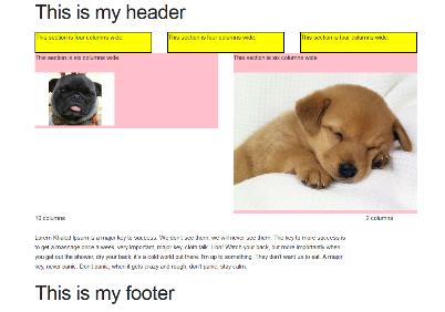
<img src="https://www.mhswebdesign.com/storage/2016/02/pug-puppy.jpg" /> - Let’s fix the large image so it’s not breaking our design since it’s so large. Add one of Skeleton’s utility classes to fix this:
<img class="u-max-full-width" src="https://www.mhswebdesign.com/storage/2016/04/cute-dog-on-blanket.jpg" />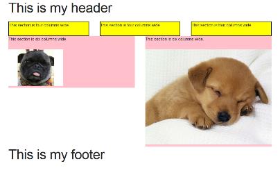
- Obviously, if we were designing a real page, we’d try to use the same size image for balance. The point of this is to illustrate that we can make images responsive by using a special utility class that comes with Skeleton so we can ensure our design looks good no matter what screen size it is being viewed upon.
- If you didn’t do it on Friday, add a background-color to the four and six column sections. Go into the skeleton.css file, find the four and six column declarations, and add background-color: pink; (or whatever color you want) after width right inside the curly brackets. Don’t forget to end with a semi-colon!
- Add one more row to your page below the six column sections and above the footer. Make this have two sections, one that is ten columns wide and one that is two columns wide. Add a paragraph in each section that says ten columns or two columns. Do this by copying and pasting from your previous code. Add another paragraph in your ten column section by adding new p tags and adding a paragraph from DJ Khaled. What happens to your text?
- Open your page in Firefox, go to the menu, developer, then responsive design view. Let’s check out what happens when we shrink the browser window.
Web Frameworks and Bootstrap
- Working in pairs, please find the answers to the following questions:
- What are front end frameworks?
- Why should you consider using them?
- What are some examples of them?
- What is Bootstrap?
- How is Bootstrap different than Skeleton?
- What are some well-known sites made with Bootstrap?