Today’s goals:
- Finish 3rd quarter survey
- Finish responsive website reviews
- Begin creating a responsive webpage with media queries
Today’s featured website:
- http://orangeyouglad.com/– A well-designed site that is also responsive!
Responsive website reviews
- Go to 3 of your favorite websites (or really any websites you want).
- Make a note as to whether each one is responsive. If a site is responsive, note the differences in design at different screen sizes. Does the menu change? Does the layout change? What else changes?
- Please enter the information about these sites into this Google form. We will share as a group afterwards.
Create a responsive webpage using media queries
- You are going to make one responsive webpage by using media queries
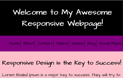
- First, take a look at the page you’re going to work with. This is what it looks like at the smallest screen size. Your mission is to design the page for three larger sizes.
- The differences you will design for this page at larger sizes include a vertical menu and different background colors.
- Use the code from March 16 as a guide. You have seen this code before and have worked with it!
- Open Notepad++ and start a new page with this code.
- Now, design the page for a minimum width of 651px and a maximum width of 1000px. The nav width should be 15% and the background color should be yellow. The section width should be 80% and the background color should be blue.
- Next, design the page for a minimum width of 1001px and a maximum width of 1300px. You will have to add the max-width and min-width code yourself; look at the previous media query for help. The nav should be 10% and the background color green. The section should be 85% in width and have an orange background color.
- Finally, your last media query is for a minimum width of 1301px. The nav should be 10% wide and turquoise. The section should be 85% and beige.
- Now, launch your site in Firefox. Go to the top right “hamburger” menu and select Developer, Responsive Design View. See how your site changes at different screen sizes.
- For fun/extra credit: change the cursor for each screen size. Try adding cursor: name of property to nav or section. For example, add cursor: zoom-in below the background-color line in your nav or section. Also try cursor: wait;, cursor: not-allowed;, and cursor: url(https://www.mhswebdesign.com/storage/2016/03/keysmall.png), auto;. See more on the CSS cursor property here.
- Questions: Why do we get rid of the Font Awesome icons at the smallest screen size? How can we determine what minimum and maximum widths to use? Is it a good idea to have your design change background colors for different screen sizes?