Today’s goals:
- Review responsive design
- Introduction to Skeleton, a style sheet that can be used to make websites responsive
Today’s featured website:
- http://metrocosm.com/disputed-territories-map.html– This could potentially be a helpful website for your history class. Is it responsive?
Responsive Web Design Review
- Responsive web design is the act of making your webpage look good on a variety of screen sizes. There are many different ways to create a responsively designed webpage. There are many tools and approaches to help create a responsively designed site, some of which you will learn in this class.
- We’ve already practiced used CSS media queries to create responsive webpages. How do media queries work? What do they do?
Getting started with Skeleton
- About
- What is it?
- Why use it?
- Let’s look at this sample site, Skeleton’s website and code
- This site was built with Skeleton- how many columns do you see? How about this site? What happens when we shrink the browser window?
- Questions
- Why is a grid design helpful for making a website responsive?
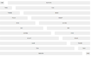
- What is important about the number 12?
- What are the media queries based upon?
- What is an external style sheet?
- Activities
- Let’s draw a 12 column grid on paper and create webpage sections
- Let’s download Skeleton and put it in a folder on the desktop
- Let’s check out the files inside the folder
- Let’s open in Notepad++
- What is normalize.css and why would you use it?
