Today’s Goal:
- Practice using CSS media queries to make a table responsive
Today’s Featured Site:
- http://www.storytrail.co/– Explore some major cities right in the browser! How does this site look on a small screen?
Responsive Tables
- Write down answers to the following questions:
- When is it a good idea to use a table on a webpage? What types of content would you use a table to display? Why?
- Did you use a table in your webpage project? Is it responsive?
- What issues do tables have when going from a large screen to a small screen?
- How could we use CSS media queries to change how tables look on small screens? What would you change? Why? (hint: think about how much space a screen has for displaying content either vertically or horizontally).
- Find a couple examples of tables on a webpage. See if you can find one that is responsive. If you’re stumped, just begin by checking out the webpages of sites you like or well-known sites. Write down these sites somewhere so we can refer to them later.
Practice:
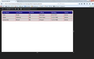
We are going to take a basic table that shows a partial Patriots roster. To make it responsive, we’re going to add 1 media query that changes how the table looks on a small screen.
There are many different ways to make a table responsive (i.e. mobile-friendly, adaptable to a small screen). The approach you take will depend upon your design- what does your table look like at full size and what data does it contain?
Some common approaches to make a table responsive include changing its display (to block to make table data line up vertically rather than horizontally) and using color to highlight different sections.
To do:
- Open Notepad++ and copy and paste this code into a new Notepad++ file. Save it as responsive_table.html.
- Launch this page in Firefox and let’s check it out in responsive design mode. What happens to our table as the screen gets small? How could we fix this? Why is the table somewhat responsive/flexible? Hint: look at its width.
- First, let’s remove the CSS comment around our media query. We have a media query with no value for max-width and we need to decide what number to use here. Let’s shrink the table and pick a break point in pixels. Why are we using max-width and not min-width here? What does max-width mean?
- One way to make a table responsive is to change the display. Should we change our display to block or inline if we want to make our table data line up vertically and not horizontally?
- Let’s talk about tr:nth-of-type(odd). This basically says every odd child of a table row (table cells) will have a white background color. We have done this to make different sections of the table stand out so that, in our example, each player has a different background color. Let’s add another table row by copying and pasting LeGarrette Blount’s info again. What happens? Why?
- What else should we do to change this to make it look better?