Today’s Goals:
- Examine responsive webpages
- Begin creating responsively designed webpages
Today’s Featured Site:
- https://thestandingo.co/– Congratulate outgoing President Barack Obama on the past 8 years. Is this webpage responsively design? How did you check and how can you tell?
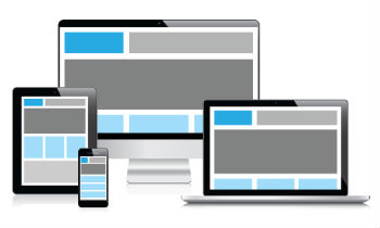
Responsive website examples
- In teams of 2 at your tables, you will be asked to examine one of the following websites on your phone and on your laptop. Write down all of the differences you notice when you view the site on your phone and on your laptop. Differences could include page layout, menu changes, etc.
- Now, open Firefox and go to your website. Click on the 3 vertical lines (the hamburger) in the top right corner of Firefox. Go to Developer, and then responsive design mode. Drag around the bottom right corner of the box to see the changes to your website as the screen shrinks and grows. Try to figure out at what pixel width the design changes.
- http://www.medfordma.org/
- https://www.mhswebdesign.com/
- http://www.apple.com/
- https://www.starbucks.com/
- http://www.nba.com/
- https://www.tufts.edu/
- http://www.newbalance.com/
- Let’s check out one more example here- responsively designed webpage menus that start small and grow as the screen size increases
Creating Responsive Webpages: Some Approaches
- Responsive web design is the act of making your webpage look good on a variety of screen sizes. There are many different ways to create a responsively designed webpage. We are going to look at a couple today and learn a few particular methods and frameworks over the next few weeks. There are many tools and approaches to help create a responsively designed site, some of which you will learn.
- Please download this code, open a new Notepad++ file, copy and paste the code there, and save it as responsive1.html.
- Auto height and width (default for block-level items when dimensions not specified). What happens to text box when we use this? Let’s shrink the browser window to do a responsive test.
- Width percentages– what does this mean for different containers or screen sizes? What happens when we change our width and top values to percentages? Why? Again, let’s shrink the browser window to do a responsive test.
- CSS media queries– let’s first watch this video.
- Before we work with the code based off of the video, let’s do a quick sketch. In the video, we saw four boxes containing an image and some text shift around as the screen size grew and shrunk. Think about the four boxes and how much space they take up percentage-wise as the screen gets bigger or smaller. Let’s draw them at 100%, 50%, and 25%.