Today’s goal:
- Continuing practicing with CSS media queries to design webpage for different screen sizes
Today’s featured website:
- http://omgspace.net/– Travel through space without leaving your browser!
From Friday- CSS media queries
- You’re going to work in pairs to complete this project
- Here is the code you should have so far; we did this together on Friday. See part 1 here: https://codeshare.io/FNaTW.
- You’re going to create media queries with styles for the following screen sizes: 0px to 650px, 651px to 800px, 801px to 1300px, and 1300px plus. You will use max and min widths to do this.
- Remember, we start small and then get larger, so you’ll begin with the smallest screen size, 0-650px. Here is the code to start with (see part 2, line 93): https://codeshare.io/FNaTW
- Make the width of the nav and section 100%. The background color of the nav should be purple and the section should be pink. The float should be none (why?). The nav needs to clear right.
- The bullets (li) need to be horizontally displayed. Should you have display: block or display: inline? Try what you think works and see what happens.
- The smallest screen size was the most complicated since we had to change the menu (the nav) from displaying vertically to horizontally. Now we just have to focus on the nav and section sizes and colors as we scale the screen size up.
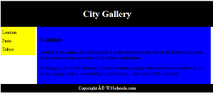
- Next, create a media query with a min-width of 651px and a max-width of 800px. You can do this by copying and pasting the code you just used for the 0-650px media query. Get rid of the li since you don’t need that for this screen size. Now, the nav width should be 15% and the background color should be yellow. The section width should be 80% and the background color should be blue.
- Now make a media query with a min-width of 801px and a max-width of 1300px. Copy and paste the code you just wrote for the previous media query. The nav should have a width of 10% and a background color of green. The section should have a width of 85% and a background color of orange.
- Your last media query will simply be a min-width of 1300px. This means any screen that is at least 1300px (like a laptop or desktop) will use these styles. The nav should have a width of 10% and a background color of turquoise. The section should have a width of 85% and a background color of goldenrod.
- Question: Is increasing and decreasing the browser size a good way to test how your page looks at different screen sizes? Why or why not?
- If you’re curious, this site has some screen sizes for popular devices to help take the guess work out of responsive design.
- Next project: OK, now you have an example of a responsive webpage with a header, footer, side menu, and main section! Your next step is to plan for a webpage that uses this is a template. It will have 3 pages. Start coming up with topic ideas now, let me know what you’re thinking, and then you can plan colors, Google fonts, etc.