Today’s goals:
- Special announcement- check out this free Girls Who Code summer camp for girls entering grades 11 & 12 (website here)
- Discuss Thursday’s Harvest of the Month & review where to get images
- Continue practicing CSS display- block, inline, and inline-block
Today’s featured website:
- http://www.windows93.net/– Experience what a computer was like before you were born! Don’t forget to view the code (ctrl u) and see what you recognize. Be sure to click around on the site and see what happens.
- Reminder: our featured websites (and sometimes apps) are chosen to inspire you and to help you connect what you’re learning in class to the “real world.” I choose them based upon their design/concept creativity, content, and sometimes interactivity. You’re always welcome (for extra credit) to suggest a website or app to be featured in class. Email me, tweet @MHSCoders, or tell me in class!
Harvest of the Month reminders:
- Everyone must finish something, whether you work individually or with others.
- You must use only the images sources that are listed. If you find another stock image website, please run it by me first. What you create is going on the school website and social media so we must only use images that are legally available. We went over this at the beginning of the year and it’s very important that we follow these guidelines.
Today’s project:
Review, Practice, and Challenge: Block, Inline, & Inline Block
- You’re going to create a simple page to help you better understand how to use block, inline, and inline-block, and how these CSS display values affect elements on your page.
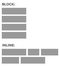
- Remember, the CSS display property controls how the “invisible box” around an element (the CSS box model) is displayed. Some of the most common display values are block, inline, and inline-block.
- Review and examples:
- Block elements take up as much space as they can (the full width of a page or container) and start on a new line (think paragraphs, headlines). They also respond to width and height values.
- Inline elements (the default display) are inline with the rest of the content and don’t start on a new line (like images, links). Inline elements don’t respond to width and height values (ex. You can’t make a link 50px wide and 20px tall; the link will be as long as the text is).
- Inline-Block can make elements appear next to each other and respond to the styling options available for the box model (margins, borders, padding, width & height). Inline-block is often used to turn links into a horizontal navigation bar like this one, for example.
- Practice and Challenge:
- Open Notepad++ and start a new page.
- Start by creating a basic page (remind yourself of the set-up in part 1 here if necessary)
- Let’s create a horizontal menu for your new page. First, we’ll add the HTML and then we’ll add the CSS.
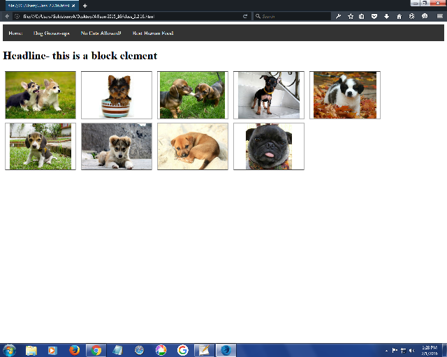
- Add four bullets with links to begin your horizontal menu. Check-in here for bullet and link reminder. Call these bullets (essentially your menu) Home, Dog Grown-ups, No Cats Allowed!, and Best Human Food (this will all make sense later).
- Now let’s style these bullets with some CSS. Add an li to your style sheet and give it display: inline and add a ul with list-style-type: none; background-color: #333333; overflow: hidden; and a margin and padding of 0px (like this). This basically made the bullets, which are by default block elements, inline, so they would display next to each other horizontally for our menu.
- Now we want our bullets to look more like a menu and less like links horizontally placed. We have to give them a background and some color. We’ll begin by comment out the display property in your style sheet for li (should look like /* display: inline */). Add float: left to li. Like this.
- Let’s style the links in your bullets to make it look more like a menu. Add li a (that refers to the links in your bullets) to your style sheet and add display: inline-block; color: white; text-align: center; padding: 14px; text-decoration: none; (like this). Grab the li a:hover from there if you want.
- You should have a decent horizontal menu! If not, check your code with this. If yes, feel free to change some colors if you want.
- Let’s add a headline to see what a block element does. Add an h1 in your HTML below your bullets that says “I just love puppies!”
- Before we add puppies, let’s add some divs (block elements) to our page as placeholders for our puppy images. We’re going to do the same thing we did yesterday by creating a class called box and adding div tags with that class- nine divs for nine puppy images!
- Add 9 opening and closing div tags and in each one add div class=”box” below your headline. Like these.
- Let’s now add the box class to our style sheet. Create a class in your style sheet and call it .box. Give it a width of 200px, a height of 133px, and display: inline-block. Add a border by using border: 2px groove #000000. Check-in here.
- Now you need to add the images. The list of image names and an example of how to add them are here.
- Pick 2 or 3 images you like and add them below the div tags to show how the default display for images is inline. Even if you add the images on separate lines in your code in Notepad++, they will display inline (next to each other).
- One of those images is the same breed as my dog (you might find him on our class website)! Pick the one you think it is and add the answer in a paragraph below your images to show how a paragraph always has a display of block. Example: write “dog in leaves” if you think that’s it (it’s not!!).
- Extra challenge: Using this code as a guide, see if you can add a dropdown menu to one of the menu items in your horizontal menu (maybe try Best Human Food). You will have to add the appropriate CSS and HTML to your page and modify it to make it work.